A static cling reads sharp and sits flush in the frame or it doesn’t, and both outcomes are decided in the file long before anything is printed. Two questions drive the whole setup: which side of the glass the cling mounts to, and whether the artwork is built at the right size and resolution for that mount. Answer those correctly and the print goes on clean the first time. Miss them and you are usually looking at a reprint, because a mirrored logo or a fuzzy 24-inch graphic cannot be fixed with a squeegee.
This walkthrough goes in the order a print-ready file actually comes together: mount side first, then dimensions, then resolution and color, then the quirks of clear film. None of it is difficult, but each step changes the ones after it.
Decide the mount side before you touch the file
Static cling is a vinyl film with no adhesive; it holds by surface contact and a little static, and it comes as either clear or white stock. The two behave differently. Clear film generally clings on its printed face, so the ink sits against the glass. White film generally clings on its back, so the print faces the room. That single difference decides reading direction, which is why the mount choice has to come first.
Think about where a storefront hours decal is going. If it mounts on the inside of the glass so it is protected and tamper-resistant, but it is meant to be read from the sidewalk, the graphic is being viewed through the pane. Depending on the film and which face carries the ink, the artwork may need to be reversed, a mirror image, so the text reads correctly to the person outside. Printing the ink on the glass-facing side is called second-surface printing, and it is worth asking for on inside-mounted clings because the glass shields the ink from scratches and cleaning and gives a glossier look. A cling mounted on the outside facing out is first-surface and reads normally with standard artwork. The rule of thumb: confirm with your printer whether they want reversed art for your specific mount before you export, rather than assuming.
Size to the glass you measured, not to a preset
There is no universal standard size for a window graphic the way there is for a business card, because storefront glass comes in every dimension. Printers do stock a set of trade-common sizes, and they are a useful starting point: roughly 4 by 6 or 6 by 6 inches for hours and door decals, 9 by 12 inches for a small storefront promo, 12 by 18 inches for a medium piece, 18 by 24 inches for something read from across a parking lot, and 24 by 36 inches and up for full-panel coverage. The chart below shows how quickly the printable area grows across that range, which matters because area drives both your file size and your cost.
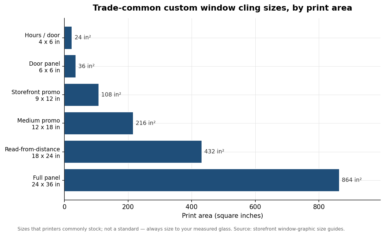
Use those numbers to choose a ballpark, then measure the actual visible pane and subtract clearance. You want the cling to sit inside the rubber seal and clear of the mullions, the bars between panes, so it does not crowd the frame or curl at a seam. A practical habit is to keep important text and logos about half an inch inside the trimmed edge as a safe margin, so nothing rides the cut or hides under the frame. Add bleed on top of that: an eighth of an inch per side is typical, though some printers ask for a quarter inch, so check the template before you build to size.
Build at the right resolution and in CMYK
Set the document to CMYK, not RGB. Screens are RGB and will show you colors, especially bright blues and greens, that CMYK ink cannot reproduce, so converting late in the process is where colors shift and clients get surprised. Working in CMYK from the start keeps what you see close to what prints.
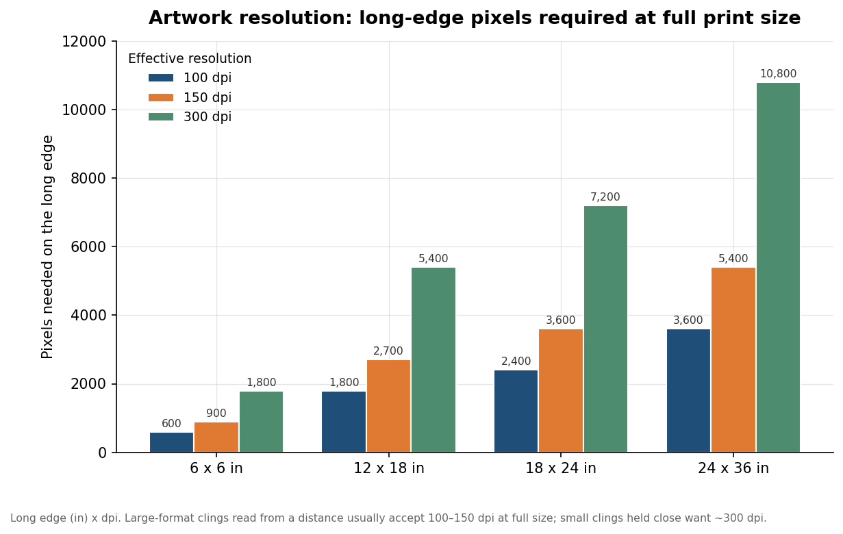
Resolution is where large-format work trips people up. Small clings held close, like a parking permit or a product label, want something near 300 dpi at final size. Large clings read from several feet away tolerate far less, commonly 100 to 150 dpi at full size, because the eye cannot resolve the difference at that distance. The trap is designing a big graphic at screen resolution and scaling it up. Resolution is fixed pixels divided by print inches, so a file that looks crisp at 6 inches turns soft at 24. The second chart shows the pixel count you actually need on the long edge at each resolution; a 24 by 36-inch panel needs 5,400 pixels on its long edge just to hit 150 dpi. The clean way to avoid the whole problem is to keep logos and text as vector art, which scales without any resolution penalty, and to place raster photos only at or above final size.
Clear film needs a white-ink plan
Clear cling is the reason a lot of first files come back for revision. On clear film, anything you leave unprinted stays see-through, and light colors and white simply vanish against a bright window. To make colors read as intended, the printer lays down a white-ink underbase behind them. Many shops want that white layer supplied as a separate spot channel in the file, often flagged as 100% black in a mask so their software knows exactly where to lay ink; check whether yours wants you to build that layer or whether they generate it. If you actually want a see-through effect, say a logo you can see the street through, you leave those areas unprinted on purpose. White film sidesteps all of this because it is opaque and needs no underbase, but you give up the glass-glow look that makes clear clings feel like part of the window.
A quick pre-flight before you upload
Run through the same short list every time and most reprints disappear. Confirm the mount side and whether the printer wants reversed artwork for it. Size the file to your measured glass with clearance for the seal and mullions, then add the bleed the template specifies. Work in CMYK, and check that raster elements hit an appropriate dpi at full size rather than at screen size. Outline your fonts or embed them so a missing typeface does not reflow the layout. For clear film, decide where white ink prints and supply or flag that layer. Export to the format the printer asks for, usually a press-ready PDF or vector EPS, and always ask for a proof, digital at minimum, before a run goes to production. The proof is the cheapest insurance you will buy on the whole job, because it catches the mirror-image and color-shift mistakes while they still cost nothing to fix.